27th May 2024
Welcome to all the data enthusiasts, analysts, and students striving to find the best way to present your data effectively. Whether you’re a management student, a business analyst, or a data scientist, choosing the right data visualization tool is crucial for making your data clear and impactful. This guide will help you navigate through various data visualization tools and select the best one for your specific needs.

Understanding Your Data
Before diving into specific tools, it’s essential to understand the type of data you have:
- Categorical Data: Data that can be divided into distinct groups or categories (e.g., types of products, customer segments).
- Numerical Data: Data that represents quantities and can be measured (e.g., sales figures, profit margins).
- Time Series Data: Data points indexed in time order (e.g., monthly sales, stock prices over time).
- Relational Data: Data that shows relationships between variables (e.g., correlation between marketing spend and sales).
Choosing the Right Visualization Tool
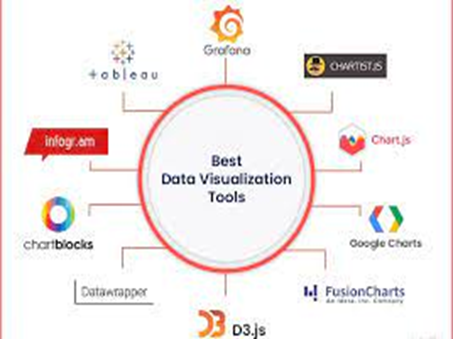
Here are some popular data visualization tools and their best use cases:
- Tableau
Tableau is a versatile data visualization and analytics tool that can be used for various types of data analysis across different industries and domains. Some of the key areas where Tableau excels include:
Exploratory Data Analysis (EDA), Business Intelligence (BI), Data Visualization
Data Storytelling, Predictive Analytics…
Best for: Interactive and complex visualizations, dashboards, large datasets
Example Use Case: You need to create an interactive dashboard that shows sales performance across different regions and allows users to drill down into specific time periods and product categories.
Features:
- Drag-and-drop interface for ease of use
- Wide range of chart types (bar, line, scatter, heat maps, etc.)
- Integration with various data sources
- Strong analytical capabilities
2. Microsoft Power BI
Microsoft Power BI is a business analytics tool that allows users to visualize and analyze data from a variety of sources. Here are some key features and applications of Power BI:
Data Visualization, Data Connectivity, Data Preparation, Interactive Dashboards, Natural Language Querying, Collaboration and Sharing, Enterprise-Grade Security, Mobile Accessibility.
Best for: Business analytics, real-time dashboards, integration with Microsoft products
Example Use Case: Your company uses Microsoft products extensively, and you need a tool to visualize data from multiple sources like Excel, SQL Server, and SharePoint.
Features:
- Seamless integration with Microsoft ecosystem
- Real-time data updates and dashboards
- AI-driven insights and analytics
- Customizable and shareable reports
3. Google Data Studio
Google Data Studio is a free data visualization and reporting tool offered by Google. It allows users to create interactive and customizable dashboards and reports using data from various sources. Here are some key features and applications of Google Data Studio:
Data Integration, Visualizations, Interactive Dashboards, Collaboration and Sharing, Customization, Data Blending, Real-Time Data, Google Workspace Integration
Best for: Free tool for beginners, integration with Google products, web-based reports
Example Use Case: You want to create a report that pulls data from Google Analytics, Google Ads, and Google Sheets to monitor your website’s performance and marketing campaigns.
Features:
- Free and easy to use
- Real-time collaboration and sharing
- Customizable dashboards
- Integration with Google products and other data sources
4. D3.js
D3.js, short for Data-Driven Documents, is a JavaScript library for creating dynamic and interactive data visualizations in web browsers. Developed by Mike Bostock, D3.js gives developers full control over the visualization process, allowing them to bind data to DOM (Document Object Model) elements and apply data-driven transformations to create rich, custom visualizations.
Here are some key features and aspects of D3.js:
Data Binding, DOM Manipulation, Data-Driven Transformations, SVG (Scalable Vector Graphics) Support, Transition and Animation, Interactivity, Modularity and Extensibility, Community and Ecosystem.
Best for: Custom and highly interactive web-based visualizations, developers comfortable with JavaScript
Example Use Case: You need a custom visualization embedded into a web application that dynamically updates based on user interactions.
Features:
- High level of customization and flexibility
- Powerful for creating complex, interactive visualizations
- Open-source and community-supported
- Requires knowledge of JavaScript and web development
5. QlikView/Qlik Sense
QlikView and Qlik Sense are well-suited for a variety of data analysis tasks, particularly in the realm of business intelligence (BI) and data visualization. Here are some scenarios where QlikView/Qlik Sense excel:
Exploratory Data Analysis (EDA), Business Intelligence (BI), Data Visualization, Self-Service Analytics, Data Discovery and Exploration, Predictive Analytics, Data Integration and ETL, Collaboration and Sharing
Best for: Associative data models, self-service analytics, data discovery
Example Use Case: You need a tool that allows users to explore data relationships and uncover insights through self-service analytics.
Features:
- Associative data model for exploring relationships
- Self-service capabilities for end-users
- In-memory data processing for fast performance
- Variety of chart types and visualization options
6. Excel
Excel is a versatile tool that can be used for various types of data analysis, making it widely applicable across different industries and domains. Here are some scenarios where Excel excels:
Basic Data Analysis, Statistical Analysis, Financial Analysis, Graphical Analysis, Data Visualization, PivotTables and PivotCharts, Data Cleaning and Transformation, What-If Analysis, Data Mining
Best for: Simple visualizations, quick data analysis, widely used and accessible
Example Use Case: You need to create quick charts and graphs to present data from your class project or a small dataset.
Features:
- Easy to use and widely available
- Basic chart types (bar, line, pie, etc.)
- PivotTables for data summarization
Conditional formatting for quick insights
Matching Data Types to Visualization Tools
- Categorical Data: Use bar charts, pie charts, and column charts in tools like Excel, Tableau, or Power BI.
- Numerical Data: Use histograms, scatter plots, and box plots in tools like Tableau, Google Data Studio, or D3.js.
- Time Series Data: Use line charts, area charts, and time series plots in tools like QlikView, Tableau, or Power BI.
- Relational Data: Use scatter plots, bubble charts, and heat maps in tools like D3.js, Tableau, or Qlik Sense.


